Dashboards are made up of individual widgets that can be customized to suite your reporting needs. There are 5 widget types available in Cobalt and each serves its own purpose. Choose the widget type that best aligns with the data source used and the insights desired.
📝 Note: For information on how to create a Dashboard and the basics of a widget, see Creating Dashboards
Widget Types
Time Series Chart
Time series charts are best for visualizing data that is expressed over a period of time such as sales estimates. They are best to represent trends, patterns and to determine the relationship between 2 metrics. Common use cases for time series charts include sales and ad spend over time or sales estimates for multiple brands.
Cobalt gives you the option to see a traditional line graph version or a stacked area chart.
The line graph version is better suited to see relationships or cause and effect between metrics over time.
The stacked view is better to visualize the relative proportions of different metrics within a dataset. They make it easy to see how each category contributes to the whole and how these contributions change over time.
A time series chart can also either be a line chart or a column chart, where the X-Axis is always data points at successive intervals of time. You can select one or two metrics for the Y-Axes.
The Column view makes it easy to compare values between different categpories or groups for an aggregated amount of time. In this view you can clearly see who the leader is in sales over the given date range.
Categorical Chart
Categorical Charts can be great to represent proportions to a total, such as market share. A categorical chart can either be a donut or pie chart or a column chart. Its best to group by larger aggregations of data such as a category, brand, or ad campaign type vs smaller data sets like ASINs.
Table
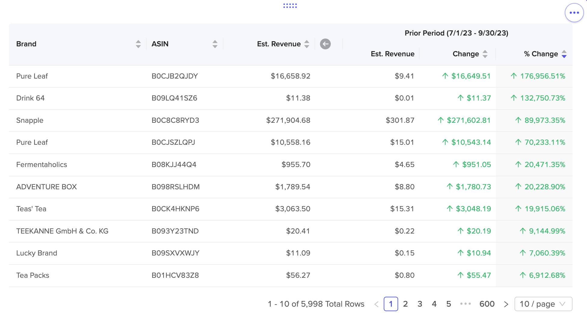
Table views are perfect when you want to pack a lot of different data points into an area. They are also good for aggregating to multiple levels or for more detailed, lower level metrics like ASINs level details.
To utilize a Table widget, select "Group By" categories and as many metrics as you'd like. Each category and metric is a column in the table, and the categories that the table is grouped by combine to form the basis of each row.
Metric
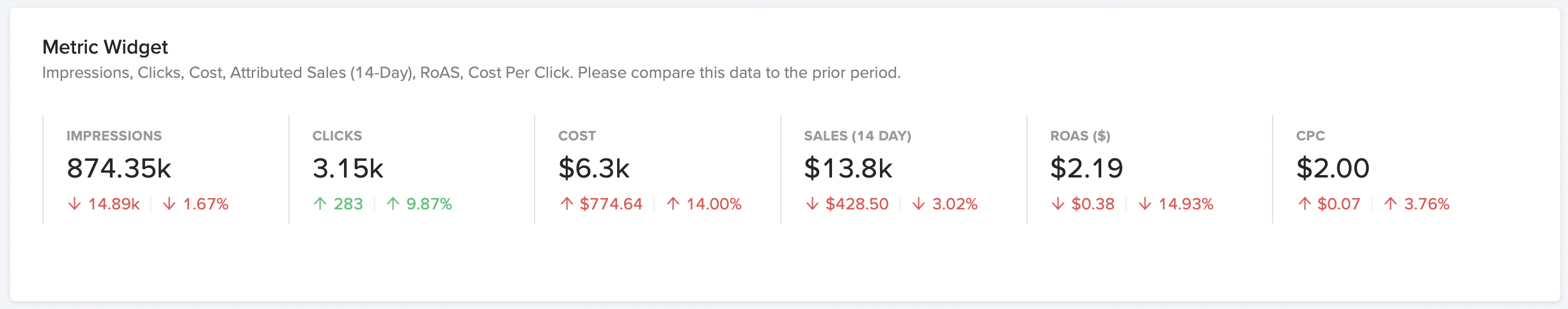
The Metric widget displays as one or more metrics with an optional notation that compares the metric to a prior period. You can think of this as a rollup or total view. Metric widgets are great for high level stats and metrics that can communicate the overall picture of a data set easily. Metric widgets are a great compliment to other widgets in a dashboard to make it comprehensive and easy to read for your audience.
Each metric will be aggregated by the function that best serves it. For example, things like Ad cost, Unit sales, estimated revenue will all be summed while metrics like Cost Per Click (CPC) will be averaged.
When using a Metric widget you will also be able to see a trend over the previous period both as a number and a percent. This gives you a great way to compare performance at a glance and make correlations between different data points.
Custom Text
The Custom Text widget allows you to add custom text within your dashboard to communicate with your audience. Text widgets can be used in a variety of ways, some of the most popular being:
- Give instructions to your audience about how to use the dashboard (add filters, adjust dates, select Brands etc...)
- Give insight to a corresponding widget. Ask probing questions and get your audience thinking in a certain way about the data they are being shown.
- Any other notes, instructions or insights into what the data in the other widgets is telling them or next steps to take.